Plotting Maps
Yale Young Scholars Program 2021
We’ll learn some methods to plot data onto maps, how to make them interactive, and eventually how to create dashboards for the maps.
Basic spatial data and elements of a map include:
shapes such as state or country borders
lines such as highways, lakes, rivers, roads
points such as cities, landmarks, or other important positions
I’ll be showing you some features of the tmap, usmap, and sf packages.
tmap
The tmap package contains outlines and geographies of continents, countries, states, and counties. Maps are created in layers, similarly to ggplot objects, using different tm_ prefixes.
The information about creating shapes are within the geometry column. When you load the data into R you can look at the details.
tmap example from vignette(“tmap-getstarted”)
The object World is a spatial object of class sf from the sf package; it is a data.frame with a special column that contains a geometry for each row, in this case polygons. In order to plot it in tmap, you first need to specify it with tm_shape. Layers can be added with the + operator, in this case tm_polygons. There are many layer functions in tmap, which can easily be found in the documentation by their tm_ prefix. See also ?'tmap-element'.
data("World") # load in World dataset

head(World)
## Simple feature collection with 6 features and 15 fields
## Geometry type: MULTIPOLYGON
## Dimension: XY
## Bounding box: xmin: -73.41544 ymin: -55.25 xmax: 75.15803 ymax: 42.68825
## Geodetic CRS: WGS 84
## iso_a3 name sovereignt continent
## 1 AFG Afghanistan Afghanistan Asia
## 2 AGO Angola Angola Africa
## 3 ALB Albania Albania Europe
## 4 ARE United Arab Emirates United Arab Emirates Asia
## 5 ARG Argentina Argentina South America
## 6 ARM Armenia Armenia Asia
## area pop_est pop_est_dens economy
## 1 652860.00 [km^2] 28400000 43.50090 7. Least developed region
## 2 1246700.00 [km^2] 12799293 10.26654 7. Least developed region
## 3 27400.00 [km^2] 3639453 132.82675 6. Developing region
## 4 71252.17 [km^2] 4798491 67.34519 6. Developing region
## 5 2736690.00 [km^2] 40913584 14.95003 5. Emerging region: G20
## 6 28470.00 [km^2] 2967004 104.21510 6. Developing region
## income_grp gdp_cap_est life_exp well_being footprint inequality
## 1 5. Low income 784.1549 59.668 3.8 0.79 0.4265574
## 2 3. Upper middle income 8617.6635 NA NA NA NA
## 3 4. Lower middle income 5992.6588 77.347 5.5 2.21 0.1651337
## 4 2. High income: nonOECD 38407.9078 NA NA NA NA
## 5 3. Upper middle income 14027.1261 75.927 6.5 3.14 0.1642383
## 6 4. Lower middle income 6326.2469 74.446 4.3 2.23 0.2166481
## HPI geometry
## 1 20.22535 MULTIPOLYGON (((61.21082 35...
## 2 NA MULTIPOLYGON (((16.32653 -5...
## 3 36.76687 MULTIPOLYGON (((20.59025 41...
## 4 NA MULTIPOLYGON (((51.57952 24...
## 5 35.19024 MULTIPOLYGON (((-65.5 -55.2...
## 6 25.66642 MULTIPOLYGON (((43.58275 41...tm_shape(World) + # use the shape of countries of the world
tm_polygons("HPI") # fill color with Happy Planet Index value (legend creates breaks and colors automatically)
# focus on a given country
filter(World, name == "India") %>%
  tm_shape() +
    tm_polygons("HPI")
The NLD_muni dataset has more specific data about Netherlands. Notice it has the geometry column, which contains the polygon information required by tmap
data(NLD_muni) # load data

tm_shape(NLD_muni) + # default polygon is municipality level
    tm_polygons("pop_men", palette = terrain.colors(5, alpha = .5))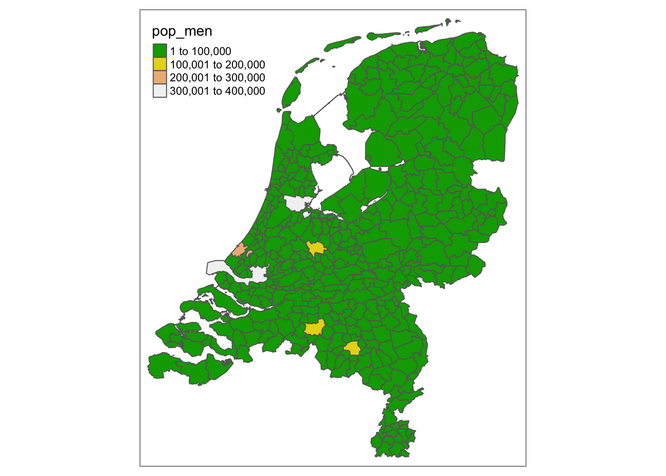
# plot population men with terrain colors palletesf and shape files
There are many packages and methods to mapping in R. There are also many different options for shapefiles. Depending on your data structure and geometry column, you may need a different package or shapefile to merge.
If we want additional shapes or geometries, we can use the sf package to load and access shape files. Some shape files can be loaded in the package, and some can be found online. For example, I downloaded the below plot from ArcGIS. We can see it has the geometry column like the above example.
# source: https://www.arcgis.com/home/item.html?id=cf9b387de48248a687aafdd4cdff1127

india_shp <- st_read("India_SHP/INDIA.shp") %>%
  mutate(id = tolower(ST_NAME)) %>%
  select(-ST_NAME)
## Reading layer `INDIA' from data source
## `/Users/kaitlin/Dropbox/Young Scholars/2021/intern projects/YS_intern_projects/India_SHP/INDIA.shp'
## using driver `ESRI Shapefile'
## Simple feature collection with 35 features and 1 field
## Geometry type: MULTIPOLYGON
## Dimension: XY
## Bounding box: xmin: 68.1202 ymin: 6.754256 xmax: 97.41516 ymax: 37.13564
## Geodetic CRS: Lat Long WGS84head(india_shp)## Simple feature collection with 6 features and 1 field
## Geometry type: MULTIPOLYGON
## Dimension: XY
## Bounding box: xmin: 76.69063 ymin: 6.754256 xmax: 97.41516 ymax: 30.79904
## Geodetic CRS: Lat Long WGS84
## id geometry
## 1 andaman and nicobar islands MULTIPOLYGON (((92.89889 12...
## 2 andhra pradesh MULTIPOLYGON (((83.94319 18...
## 3 arunachal pradesh MULTIPOLYGON (((94.86086 27...
## 4 assam MULTIPOLYGON (((95.59917 27...
## 5 bihar MULTIPOLYGON (((87.95561 25...
## 6 chandigarh MULTIPOLYGON (((76.69267 30...plot(india_shp, main = "Administrative Map of India")
We can transform geometries if needed and join shape files to data, which allows us to plot the data layers.
For example, we can join the COVID-19 case data from July 1, 2021 as below:
covid_india <- read.csv("https://raw.githubusercontent.com/CSSEGISandData/COVID-19/master/csse_covid_19_data/csse_covid_19_daily_reports/07-01-2021.csv") %>%
  filter(Country_Region == "India") %>%
  mutate(id = tolower(Province_State))

# join the data to the shape
# make sure it's in this order!
# keep only what I want
joined_data <- left_join(india_shp, covid_india) %>%
  select(Province_State, Confirmed, Deaths, Recovered, Incident_Rate, geometry)

# quick plot of Incident Rate
joined_data %>%
  select(Incident_Rate, geometry) %>%
  plot()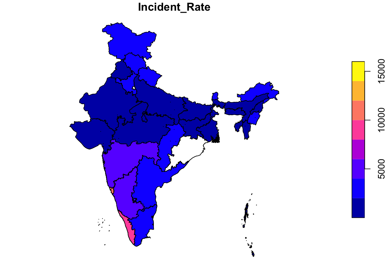
# use tmap to plot incident rate
tm_shape(joined_data) +
tm_polygons("Incident_Rate") 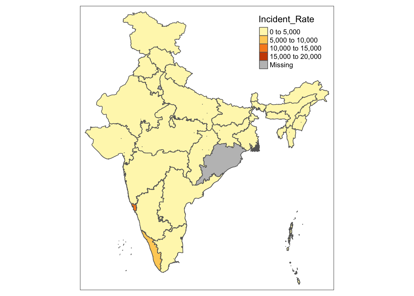
usmap
The usmap package has some convenient methods to plot or transform within the US specifically, and can return a ggplot2 object, so other layers such as themes, labels, or even other data, can be added using ggplot functions you are already familiar with.
## Conveniently plot basic US map

### Description

Conveniently plot basic US map

### Usage

plot_usmap(
  regions = c("states", "state", "counties", "county"),
  include = c(),
  exclude = c(),
  data = data.frame(),
  values = "values",
  theme = theme_map(),
  labels = FALSE,
  label_color = "black",
  ...
)
First we load in data using datasets included in the usmaps package
# load data
  # unemp includes data for some counties not on the "lower 48 states" county
  # map, such as those in Alaska, Hawaii, Puerto Rico, and some tiny Virginia
  #  cities
  data(unemp)
# create cutoffs which will be used to create color bins
  unemp$colorBuckets <- as.numeric(cut(unemp$unemp, c(0, 2, 4, 6, 8, 10, 100)))
  data(statepop)

plot_usmap() # simple plot of the US
Using the built-in plot_usmap, we can specify what regions to map, for example, show all counties. I add title, subtitle, and color the background using ggplot2 functions.
plot_usmap(regions = "counties") + # specify what to map
  labs(title = "US Counties", # add some ggplot stuffs
       subtitle = "This is a blank map of the counties of the United States.") +
  theme(panel.background = element_rect(color = "black", fill = "lightblue"))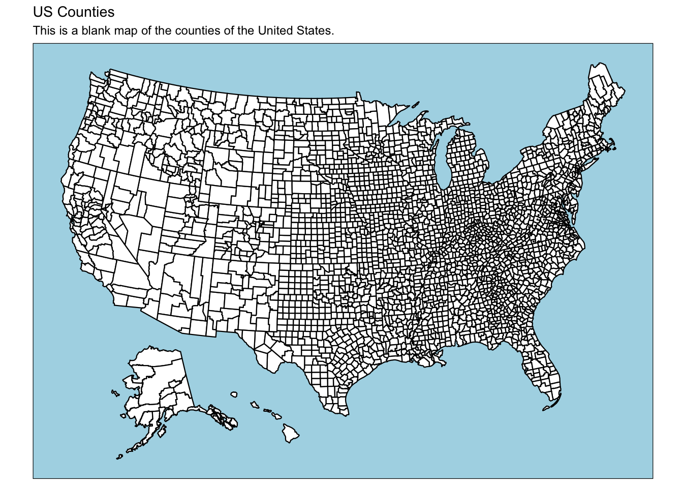
Next, we can specify what data to map. Of course, the dataset needs to include a column with information that can be mapped. In this case unemp$fips holds the geometry information that plot_usmap uses.
From wikipedia: The Federal Information Processing Standard Publication 6-4 (FIPS 6-4) is a five-digit Federal Information Processing Standards code which uniquely identified counties and county equivalents in the United States, certain U.S. possessions, and certain freely associated states.
plot_usmap(data = unemp, # specify dataset to use (uses region info from dataset)
           values = "colorBuckets", # name of column to fill map (as string)
           theme = theme_dark()) # change theme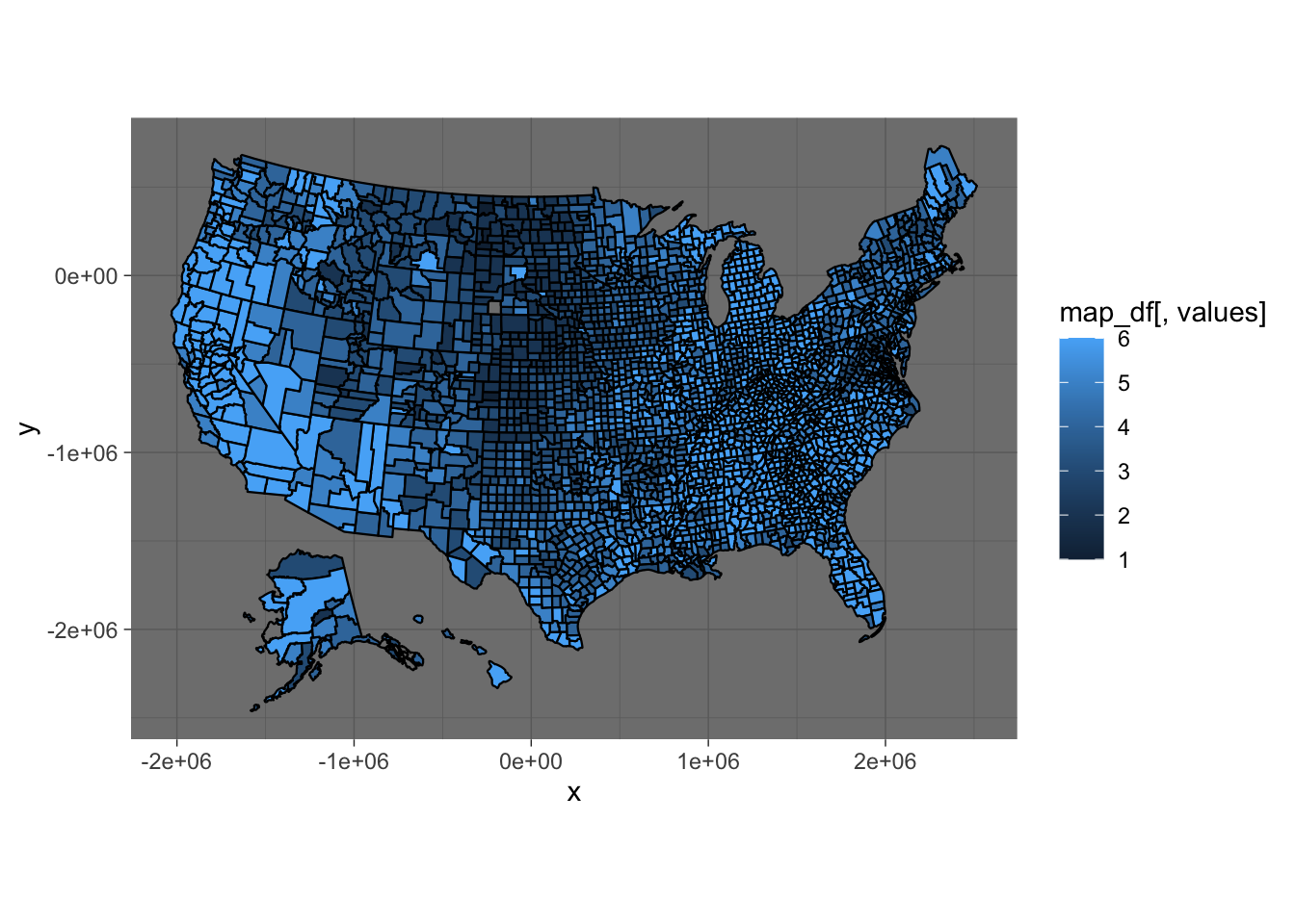
Using the include variable, we can instruct the function to only plot California
plot_usmap(include = "CA", # show only CA
           data = unemp,
           values = "colorBuckets",
theme = theme_dark()) 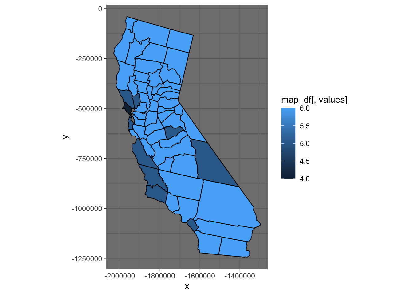
Next, we explore the statepop dataset, and use the scale_fill_continuous function from ggplot2 to define the colors. We can use ggplotly to add some basic interactivity. When you hover, the tool tip shows up.
plot_usmap(data = statepop,
           values = "pop_2015") +
  scale_fill_continuous(low = "white", high = "red", # define high and low colors
                        name = "Population (2015)", # name of legend
                        label = scales::comma) + # use commas in scale
  theme(legend.position = "right") # add on ggplot theme components
# we can wrap any of these in ggplotly to make them interactive
ggplotly(plot_usmap(data = statepop,
           values = "pop_2015") +
  scale_fill_continuous(low = "white", high = "red",
                        name = "Population (2015)",
                        label = scales::comma) +
  theme(legend.position = "right"))
# or, save the plot and apply ggplotly
p <- plot_usmap(data = statepop,
values = "pop_2015") +
scale_fill_continuous(low = "white", high = "red",
name = "Population (2015)",
label = scales::comma) +
theme(legend.position = "right")
ggplotly(p)Plotting points
Now, if I had data with latitude and longitude, I could also create a map, and can even do so using simple ggplot2. Below I use the citypop dataset to plot the most populous cities in the US in 2010. The color signifies population size; lighter blue is more populous.
ggplot(data = citypop,
           aes(y = lat, x = lon, color = city_pop)) +
   geom_point()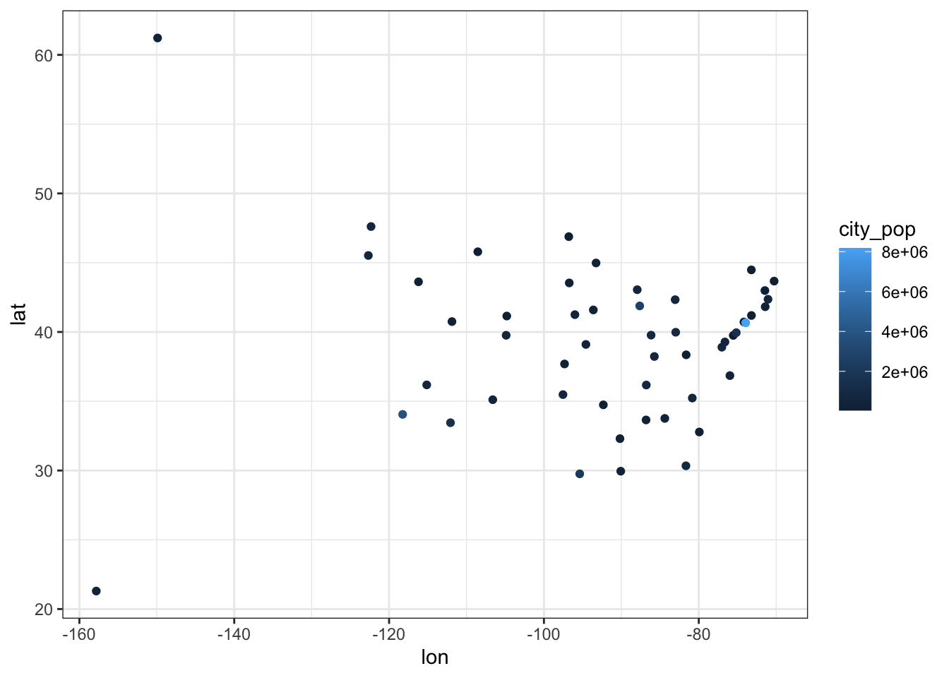
Notice that this only maps the points, it does not have the outlines of the states. This isn’t too helpful for a map. So, we want to add in the shape files!
Well, in order to do that, I need to transform the data projection to match up with the projection used by usmap:
citypop_map <- usmap_transform(citypop) # this function allows you to change the projectionNow, I can put the points from Most Populous City on a blank US Map:
plot_usmap() +
  geom_point(data = citypop_map,
aes(y = lat.1, x = lon.1, color = city_pop))![]()
Notice the way the code was written above. One way to think of the logic of the layers, is that we are adding the points to an existing map. If we tried to just add our ggplot object with points to another ggplot object with the chloropleths (shape outlines), R would give us an error. We cannot add two ggplot objects! Instead, we just add the points as a new layer, by defining the data and aethetics in the call to geom_point
plot_usmap() + ggplot(data = citypop,
           aes(y = lat, x = lon, color = city_pop)) +
  geom_point()
Now, we can even “add” our colored population map from earlier to the points. This is just for illustrative purposes, though. The data are from different sources and different years, so this wouldn’t be done otherwise.
US Population 2015
p <- plot_usmap(data = statepop,
           values = "pop_2015") +
  scale_fill_continuous(low = "white", high = "red",
                        name = "Population (2015)",
                        label = scales::comma) +
  theme(legend.position = "right")

p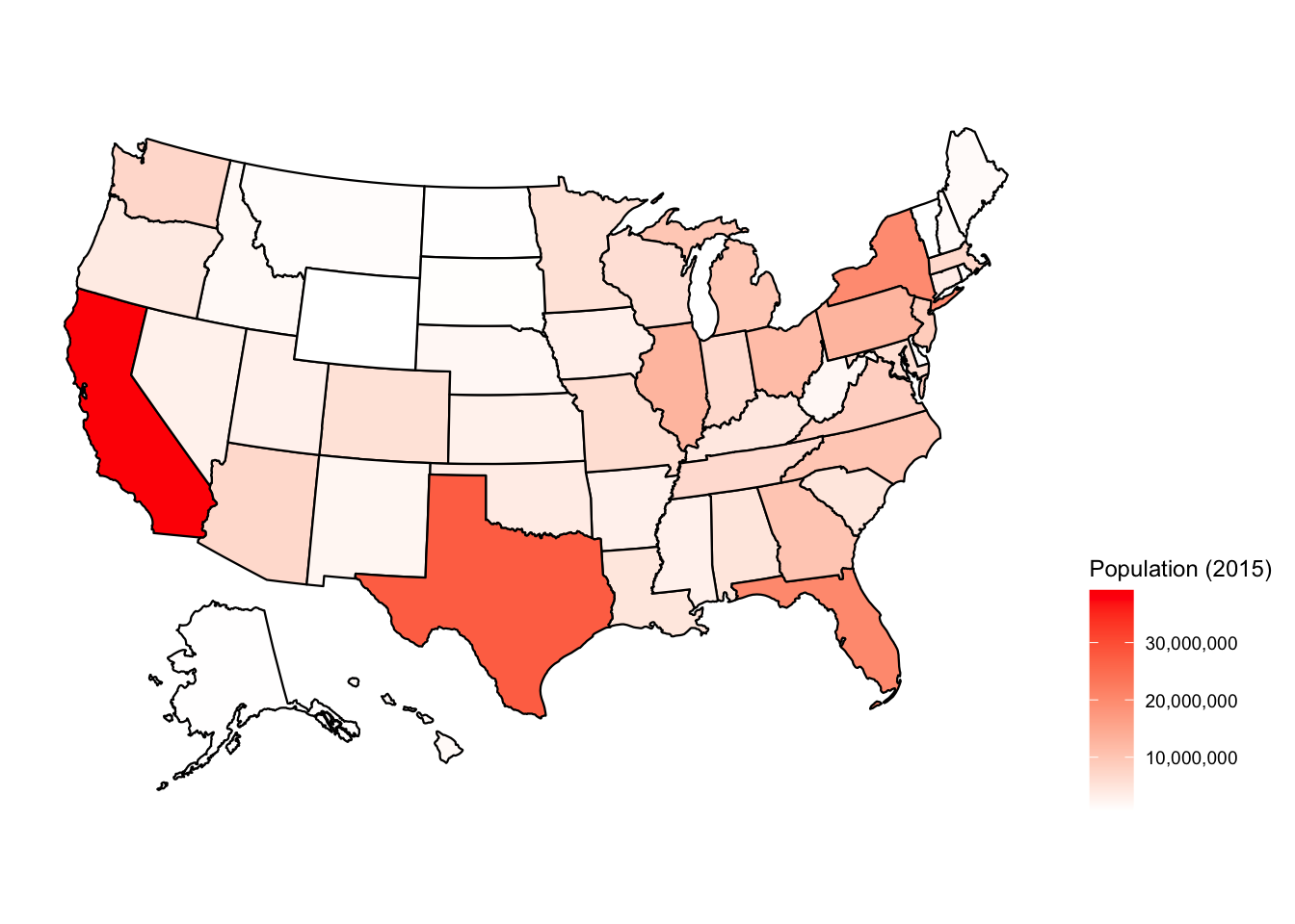
Add layer
# this is another way to add layers and plots together
# add plot layers to previous object "p"
p2 <- p + geom_point(data = citypop_map,
           aes(y = lat.1, x = lon.1,
               color = city_pop,
               size = city_pop, # the dot size will be proportional to population
               text = paste("Population:", city_pop, "\n", most_populous_city, abbr))) + # define hover text; "/n" gives a line break
  theme(legend.position = "right") +
   scale_color_continuous(low = "lightblue", high = "darkblue",
                        name = "Most populous city (2010)",
                        label = scales::comma) +
  labs(title = "Most populous city in each state in 2010 \n and state populations in 2015 \n Source: US Census")

# you can ignore the warning message: Ignoring unknown aesthetics: text
# it seems like this is a bug
# using text inside the aes lets you define what will show in the hover tooltip with plotly. as you can see, it does appear correctly in the plot!

ggplotly(p2, tooltip = "text") # defining tooltip to be "text" will show ONLY what is in aes(text = ...); Otherwise shows all variables (and default names) in aes()
Additional Resources:
Making maps with R (focus on tmap)
USMap: Advanced Mapping Tutorial
Mapping Chapter; Data Visualization: A practical introduction, by Kieran Healy
Maps Chapter; Interactive web-based data visualization with R, plotly, and shiny
COVID-19 Dataset from:
“COVID-19 Data Repository by the Center for Systems Science and Engineering (CSSE) at Johns Hopkins University”, https://github.com/CSSEGISandData/COVID-19